WP Mobile Bottom Menu is a WordPress plugin that provides a customizable sticky bottom navigation menu for mobile users. It enhances mobile user experience with easy navigation and design flexibility. Below are 25 ui/ux & prototyping apps with similar functionality to WP Mobile Bottom Menu, matched by what each product actually does — not ranked or scored. Explore each to find the closest fit for your use case.
WP Bottom Menu is a WordPress plugin that lets site owners add a customizable bottom menu with WooCommerce support, icons, and style options. It enhances navigation and user experience, especially for mobile visitors.
Bekero Mobile Bottom Menu is a WordPress plugin that adds a customizable sticky bottom menu to WooCommerce stores, visible only on mobile devices. It enhances the mobile shopping experience with quick access to menu, search, cart, favorites, and account. Designed for WooCommerce store owners seeking an app-like navigation for their customers.

Fixed Bottom Menu is a WordPress plugin that enables site owners to add a fixed, customizable menu to their website. The menu can be positioned at the bottom, top, left, or right, supports multiple links, and offers extensive styling and layout options for enhanced site navigation.

Imakash Mobile Bottom Menu is a WordPress plugin that provides a customizable, app-like bottom navigation bar for mobile users, enhancing site usability and navigation for eCommerce and service websites.

SureWP App-Style Bottom Menu is a WordPress plugin that adds a customizable, app-like bottom navigation menu optimized for mobile devices. It integrates with WooCommerce for live cart updates and supports Elementor, making it ideal for site owners seeking improved mobile UX and e-commerce functionality.
Footer Fixed Menu — Customized Bottom Navigation is a WordPress plugin that creates a fixed footer navigation bar with customizable icons, colors, and tooltips. It syncs with existing menus and is ideal for mobile-friendly sites seeking enhanced navigation.
The Menu is a WordPress plugin that enables site owners to create visually appealing, customizable mobile navigation menus with icon support, role-based visibility, and smooth animations. It enhances user experience on mobile devices and integrates with popular themes and builders.

Fly Nav Mobile is a WordPress plugin that delivers a high-performance, mobile-first navigation menu using only CSS. It offers slide-out hamburger menus and app-style bottom navigation bars, enhancing user experience and site speed. Ideal for site owners prioritizing mobile usability and SEO.

SlickNav Mobile Menu is a WordPress plugin that enables responsive, accessible mobile menus with multi-level support and ARIA compliance. It offers customization options such as adding a logo and search field, making it ideal for site owners seeking improved mobile navigation and accessibility.
Offcanvas Mobile Menu is a free WordPress plugin that lets users add fully customizable and responsive off-canvas mobile menus to their websites. It supports WooCommerce, offers design customization, and is easy to set up for site owners and designers.
Bubble Menu is a WordPress plugin that enables users to create interactive, floating button menus in a circular style. It enhances site navigation and user engagement with customizable, visually appealing menus. Suitable for site owners seeking modern navigation solutions.
Side Menu Lite is a free WordPress plugin that lets users add customizable sticky side menus to their websites. It supports unlimited menus, custom links, icon and font customization, and device-specific display, making navigation more intuitive and engaging for visitors.
WPB Floating Menu or Categories is a free WordPress plugin that adds a sticky floating side menu or categories with icons to any site. It enhances navigation and usability, supports icon customization, and works with any WordPress theme.
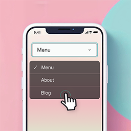
Responsive Mobile Select Menu is a WordPress plugin that automatically transforms your site's menu into a touch-friendly dropdown on mobile devices. It requires no theme modifications and offers customizable breakpoints and accessibility features.
Sticky Menu & Sticky Header is a WordPress plugin that allows users to make any element, such as menus or headers, sticky as the page scrolls. It is designed for WordPress site owners and designers who want to improve site navigation and user experience.

Arewa Mobile Bottom Navigation Bar is a WordPress plugin designed to enhance the mobile navigation experience for WordPress websites. It introduces a modern, floating bottom navigation bar that remains visible at the bottom of the screen, aiming to provide a mobile-first, app-like interface. The tool is suitable for a wide range of WordPress sites, including e-commerce, business, blog, news, and portfolio sites, as well as any website seeking to modernize its mobile navigation. The plugin offers extensive customization options, allowing users to control the appearance, functionality, and visibility of the navigation bar. Users can select between two to six navigation buttons, choose from three display modes for icons and text, and rearrange buttons via a drag-and-drop interface. Custom SVG icons with full color control are supported, and the navigation bar can include unlimited submenu items for nested menus. Additional design features include complete color customization for backgrounds, icons, text, and active states, responsive design for all device sizes, smooth hover and pulse animations, box shadow adjustments, and customizable border radius. An optional submenu header can display a logo, site title, and description. Visibility controls are a key aspect of the plugin. It can be set to display across the entire site or limited to specific pages, posts, categories, or custom post types. Device-specific visibility settings allow the navigation bar to appear only on mobile, tablet, or desktop devices, and multiple visibility rules can be combined for precise control. There are also options to hide the navigation bar in the WordPress admin area or on login and registration pages. Arewa Mobile Bottom Navigation Bar is compatible with all WordPress themes, major page builders like Elementor, Gutenberg, and Beaver Builder, as well as WooCommerce and multisite installations. It supports all major browsers and works on mobile, tablet, and desktop devices. Installation can be performed automatically through the WordPress admin dashboard or manually by uploading the plugin ZIP file. After activation, configuration is managed through a dedicated menu in the WordPress admin sidebar, with settings organized into multiple tabs for ease of use. 4 or higher. It is positioned as a feature-rich navigation solution for WordPress sites prioritizing mobile user experience.
Float menu is a WordPress plugin that enables users to create floating side menus for improved navigation and user experience. It offers customization options for colors, icons, and position, and works with any WordPress theme. Ideal for site owners and designers seeking persistent, accessible navigation.

EzzyJohn App-Style Mobile Navigation is a WordPress plugin that provides a customizable, app-style bottom navigation menu for mobile devices. It enhances the user experience for PWAs, booking platforms, and mobile-first sites by offering custom icons, links, and design options. Ideal for site owners seeking improved mobile usability.
Star Mobile Menu is a WordPress plugin that transforms your site's mobile menu into a more flexible and customizable navigation experience. It allows users to easily enhance their mobile menu's appearance and functionality without writing code. Ideal for WordPress site owners seeking better mobile usability.
Leidsens Mobile Menu is a free WordPress plugin that replaces the default mobile navigation with a smooth, app-like slide-in menu. It features multi-level sliding panels, unlimited menu depth, and a customizable admin interface, making it easy for site owners to enhance mobile usability without coding.
Sticky Mobile Buttons is a WordPress plugin that adds customizable floating action buttons to mobile versions of websites. It helps site owners increase conversions by making contact options and cart access always visible to mobile users. Suitable for e-commerce and service sites focused on mobile traffic.

Toast Mobile Menu is a plugin designed to enhance the mobile navigation experience on WordPress websites. It focuses on providing a fast and responsive menu system that can be easily customized to fit various layouts, designs, and devices. The tool aims to help site owners and developers create a seamless and engaging mobile menu that aligns with their brand identity. Among its key features, Toast Mobile Menu offers seamless integration with WordPress, utilizing native WordPress menus and requiring minimal setup. Users can fully brand their menus by customizing elements such as logos, colors, and typography. The plugin includes advanced search functionality powered by AJAX, delivering live suggestions to facilitate faster content discovery. Flexible menu icon options allow for the addition of cart, account, search, or custom icons within the menu structure. Site owners can also highlight promotions, announcements, or important content using custom menu banners. The menu design supports rich visuals, including imagery, icons, and advanced styling, moving beyond basic page lists. Smart submenu controls are available to fine-tune submenu behavior for improved navigation. Toast Mobile Menu is compatible with a range of WordPress plugins and builders, such as Advanced Custom Field, Classic Editor, Contact Form 7, Divi Builder, Elementor, Gutenberg, WP Bakery Builder, and WP Rocket. 8. org, and a Pro version. The Pro offering includes one year of priority customer support, one year of updates, and a 28-day money-back guarantee. As a solution for improving mobile navigation, Toast Mobile Menu is intended for WordPress site owners and developers seeking to deliver a branded, flexible, and efficient mobile menu experience. Its integration with popular plugins and focus on customization make it suitable for a wide range of website projects.
Flexi Menu is a WordPress plugin that enables users to create floating, vertical, dropdown, and right-click menus with a live builder. It offers responsive design, advanced styling, and easy integration, enhancing site navigation for WordPress users.
Sticky WooCommerce Category Menu is a WordPress plugin that adds a floating, sticky product category sidebar to WooCommerce stores. It enables shoppers to access product categories from any page, improving navigation and product discovery without requiring theme edits. Ideal for WooCommerce store owners seeking better user experience.
Aha Mobile Menu is a free WordPress plugin that enables site owners to add a lightweight, customizable off-canvas mobile menu and hamburger navigation. It supports slide/fade animations, logo integration, built-in search, and social links, enhancing mobile usability for WordPress sites.